
Lloyd and I have been working on figuring out the sign for the new CDC. There’s a grant and a timeline involved and it’s a little messed up right now. My stomach is also bothering me, hence this really lame post.
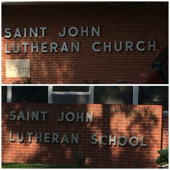
These are two different fonts. Both sans serif. If you had asked me two weeks ago if the church and school had signs on the side, I would have said no. Now I know. They do.
Does anyone want to take this over? You have $1500 to spend: go. Oh, and people have opinions. Make everyone happy.
I’m always looking at the other side of the school sign from my classroom, so I had no idea what font it was. I will fully and vocally support your decision for the CDC sign. Unless it’s ugly. 🙂
Hahaha! You funny Deborah!
And I agree with Brad…..there’s really no difference in those 2 fonts, is there?
The difference between the two signs pictured is hardly noticeable. Do people actually have strong opinions about which of those two to use? Or do they want to use a different font all together?
Just make sure you spell it right.
Solve it tomorrow, or over the weekend.???
Ha! You are all wonderful people. This really isn’t that big of a deal, it’s just time-sensitive and hanging over my head. Plus, it’s one of those things that, once it is done, people will question why it wasn’t done a different way. People. Why they gotta care about stuff?
Your site said I was commenting “too fast”, so it changed my faces to question marks!